By Hannah Stell
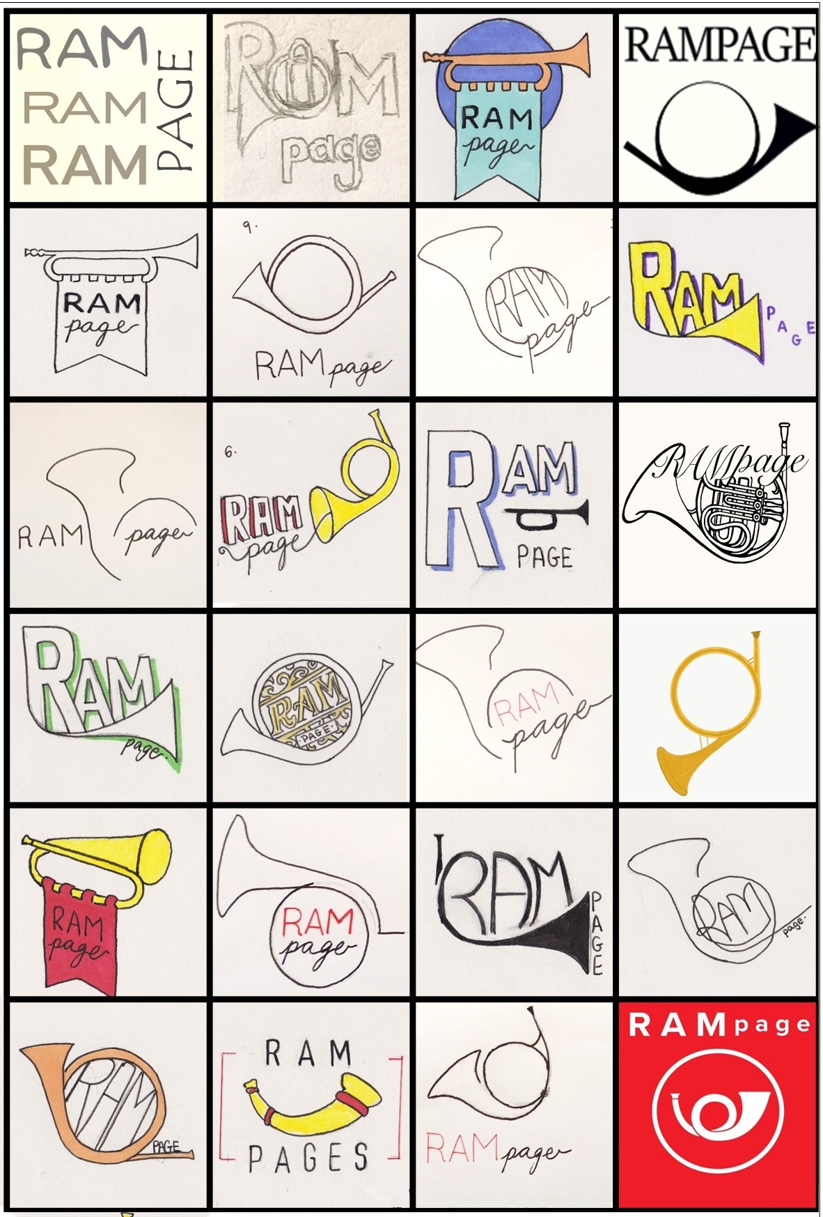
In May 2020 we asked the RAM community to put on their creative hats and have a go at designing a logo for RAMpage. We received some fantastic designs and I would like to share with you the process of choosing and designing a logo.
Follow our Instagram page to see more images of the logo design process!
Initial Designs:
It was decided that the logo should incorporate something horn or bugle inspired, as a joint musical and messenger symbol. From this I created two sets of initial ideas which focused on these design concepts.

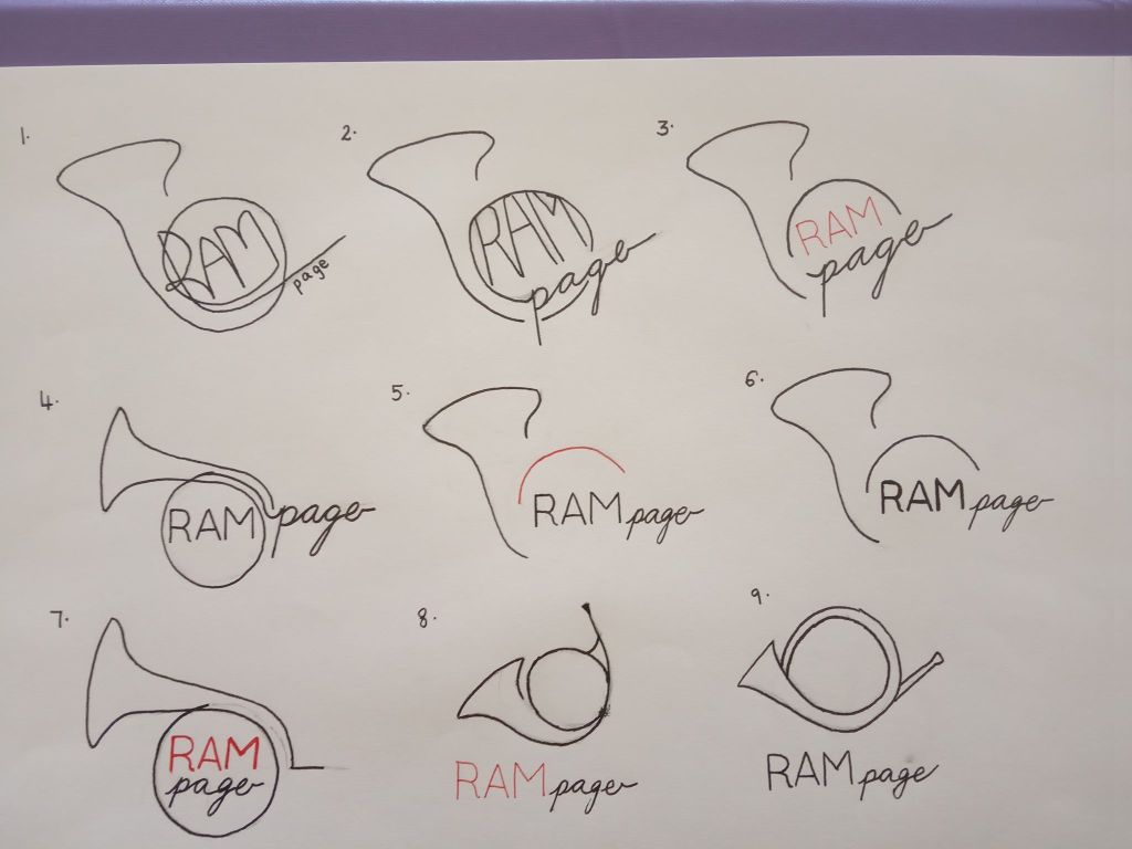
From these initial designs we chose two logos to be developed further:
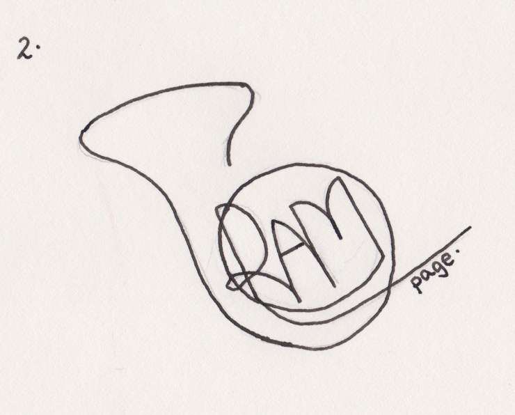

We chose to develop a logo that featured modern, minimalistic lines but whilst still having a very clear horn shape to make sure the musical link was prominent.
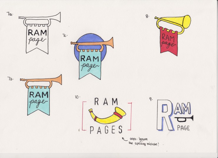
Developed Ideas:
Once we chose what design we wanted to use I moved to using a digital editing software to design the final logo.

The colour of the logo was very important. We wanted to have a splash of colour to keep the logo vibrant and fun, and we decided that using a golden colour for the horn would be the most suitable.
Also the positioning of the text was carefully considered. We played around with many configurations and chose one that is compact yet can still be read easily.
And so that brings us to the final logo!
A big thank you to everyone who submitted designs for the logo with particular thanks to Helen Kuby and Mike Prokop.
If you want to get involved and be part of the RAMpage Design Team contact me at hannah.stell18@ram.ac.uk

